We were named after the muse Clio and our first formal outfit was given to us by an enthusiastic company from Syros Industrial Design School. Back then, we were looking for a logo that all venues would love to stick on their walls, next to their most precious exhibition artifacts.
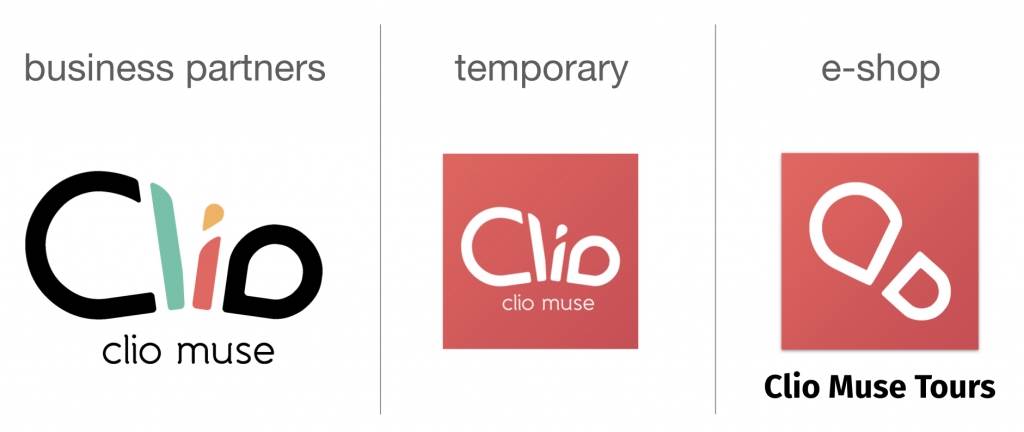
And this is what we got:

The success of our logo is that everyone sees different things in it: a butterfly, a turtle, a fish, the eternity symbol, 2 drawing brushes and the number 8 are some of the things you’ve shared with us through the years when we were asking: “What do you think of our logo?”
Our logo speaks to you like true art should and we really feel that those designers from Syros, delivered an excellent job!
Over the past 6 years, though, our company has grown. And so have your needs. You’ve been asking us to host not only museum tours, but walking city tours as well. And we’ve listened to you, as we always have. So, we took everything we learned from your preferences and our museum partners to innovate in self-guided audio tours. Along with our Android and iOS apps, we created the Clio Muse CREATE authoring tool to make it easier for all authors to create and sell their unique tours. This really helped us scale up the number of tours and destinations in which we are able to offer you a walking tour, today. (See all of our tours).
So, what was missing? An e-shop. A place we would be able to share with you our diverse portfolio of extraordinary tours and their rare and authentic stories. And here we are now: cliomusetours.com was born and our blog along with it, where we’ll be continuously sharing with you our dreams. To us, this is another important landmark in our course towards offering you the best self-guided digital tours around and we felt we should celebrate it and dress up for the occasion!
So, one late evening in our IT dept. it really happened! We desperately needed a logo to put in the upper left corner of our e-shop. Our existing logo simply wouldn’t fit and our graphic designer was long gone. So, we, the devs, felt like fooling around. We looked at your feedback and ideas and suddenly we knew.
You were right all along… Among other things, our logo looks like a footstep which perfectly reflects our walking tours. And the colour? We’re 60% women – 40% men in the office so all girls practically voted for pink. Some of the guys proudly supported pink as well! And here we are now. All of a sudden, a brand new logo emerged organically in the office thanks to your feedback, some pink power and of course our devs (thanks George!).
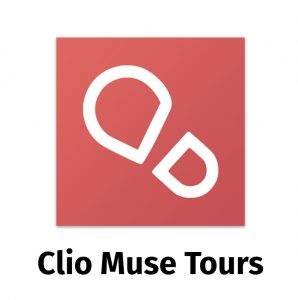
From now on, we will keep our old logo for business partners like museums, exhibitions, and other cultural institutions to help them distinguish us. Our app will also keep this logo until our major update before Christmas! However, in the travel & tourism sector, we will be using our brand new white-footstep-on-pink-background logo. We think the link is obvious!
P.S.
To make it easier for anyone to follow this change in our social media, for the next few weeks, we will be using a temporary logo that bridges these two.
